Matisse design system

Role + Team Structure
Teams involved
1 Design lead, 1 product designer, and 3 contract designers
3 front-end developers working with a team of web-view developers.
1 PM
1 Design Program Manager
My role: Design system design lead
Responsibility: Design and implement new components and patterns to support product features. Work cross-functionality to prioritize and plan for roadmaps.
Carrying over from the core-funnel redesign
Many initiatives were going at full speed in mid-2020. GoodRx product rebrand was one of a major significant success.
This new ‘look and feel’ has a code name ‘Matisse.’ Which later became the Matisse react library and the web design system I was leading on the platform team.
In Q1 2021, we started to tackle multiple product verticals with additional design support.
Leading a design system team
My involvement
Create and maintain workflows to support the embedded collaboration structure to ensure delivery.
Lead the adoption and efficient execution of the design system across teams.
Support design system rollout and plan for post-launch versioning.
Communicate frequently to educate patterns and optimize the adoption process.
Finally, hands-on, design components and their variants accordingly.

Design system onboarding handbook I created to help bring new product designers up to speed.
Start with the building blocks
We have to identify its foundation building blocks to put together a design system. Some refer to that as styles. In Matisse react, we refer to that as primitives.

Our primitives cover: Color/Elevation/Grid/Icons/Spacing guide/Type
Defining component with its basic functionality

Components range in complexity. Reducing components to a single function, like a button or a drop-down increases flexibility, making them more reusable and adoptable
Component classification
• Clear overview of the component.
• Identify similar components and their mutual exclusivity.
• The anatomy of components
• Behaviors of the component focusing on a mouse event or a tap event.
• States and variants of components when applicable.
Utilizing design tokens
Design tokens are the “subatomic” foundation of a design system implementation. Tokens are name and value pairs stored as data to abstract the design properties you want to manage.

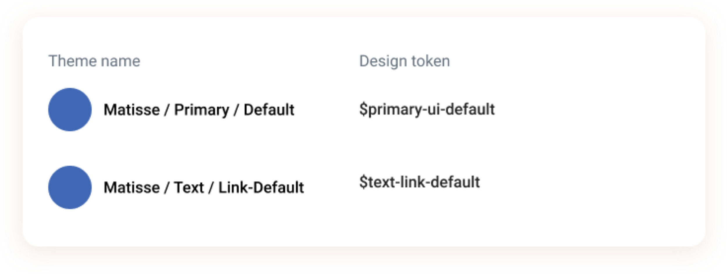
Design tokens are shared across themes; they need to be named by functions, not values.
Instead of naming $primary-blue, we called it $primary UI default. So this token can carry different value attributes across various themes such as Kroger and AAA.
Building components atomically
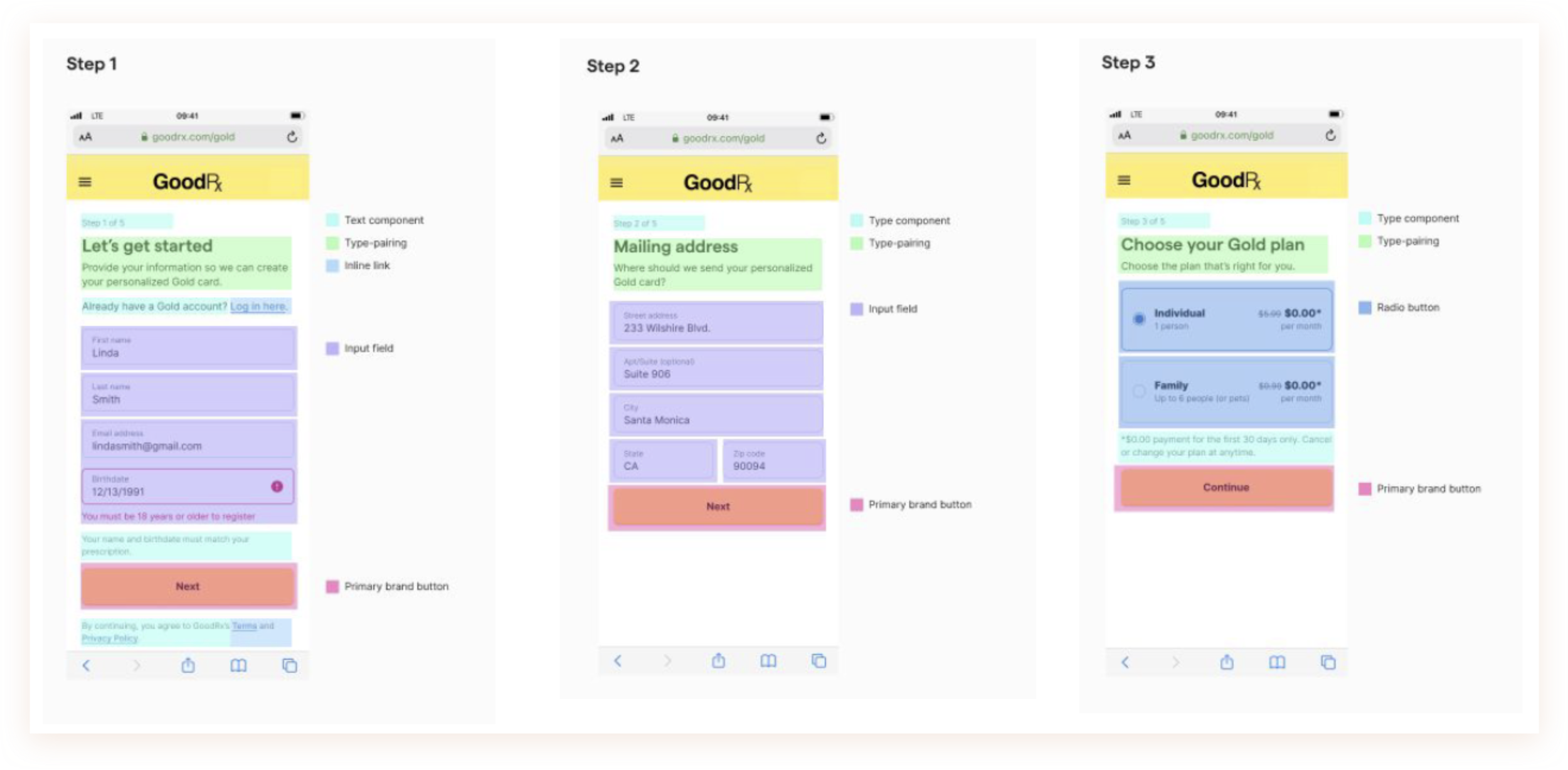
Taking designing a simple input field as an example, the first thing to do is always identify the different states of the component:
Such as default, active, success, error, loading, and disabled.
Each component is different, and their states often differ on various platforms.


Another helpful tip is to utilize variants in the master component layer inside Figma to reflect props in your code as close as possible.
Figma file organization
The ways to organize and name pages in the master library file were done diligently. I orchestrated a couple of workshops to tackle this problem space. The workshops focused on educating common practices and industry standards while soliciting ways to maintain familiarity with the design team's mental model.
In the end, we came to organize the pages by the functionalities of the components or the pattern. Each page is dedicated to one component/pattern with explicit classifications and the UI docs for developers. To better guide the browsing experience, all the frames in a page are laid out horizontally from left to right.

Ensuring adoption
To ensure the components designed are widely adopted, we first have to ensure that they are usable by product teams.

Collaboration Model
Hybrid of ‘Centralized’ + ‘Federated’ design system team model—a central team and members of other team come together to manage and govern the system.
Working on collaboration projects
Actively working with other design leads to identifying projects that need to be redesigned, then prioritizing those workstreams into our team’s roadmap while being conscious of dependencies.

Analyzing gaps
Identifying what’s currently available in the Figma design and react libraries is essential to help teams ship fast. Also, plan for when we need to introduce a new pattern to enhance the user experience.
Finally, effective communication is the key
Understand constraints and make trade-offs to keep a scope.
Create efficient task assignment and collaboration structure to support the roll-out.
Communicate timeline across channels and discuss when timeline cannot be met as soon as possible.
Help partners retain institutional knowledge of the system design.

Thank you
Other projects

GoodRx Product Redesign
Many initiatives were going at full speed in mid-2020. GoodRx product rebrand was one of a major significant success.
This new ‘look and feel’ has a code name ‘Matisse.’ Which later became the Matisse react library and the web design system I was leading on the platform team.

Notifications System Design
The notifications design pattern is notoriously known to be one of the most complex patterns to design. It interlaces with alerts, color systems, platform systems, accessibility, and so on. My approach isn’t perfect but was well thought through and planned. It communicated important matters effectively to patients using the GoodRx platforms, a priority for a healthcare app.