The notifications design pattern is notoriously known to be one of the most complex patterns to design. It interlaces with alerts, color systems, platform systems, accessibility, and so on. My approach isn’t perfect but was well thought through and planned. It communicated important matters effectively to the users using the GoodRx platforms.
Role + Team Structure
Design Lead: Strategizing, auditing, socializing adoption, final review, and UAT.
Sr Product Designer: Embed in product teams to ensure thorough use-case studies, fabrication, and UI documentation.
Engineering Team: Implementation, socializing, monitoring adoption, and QA.
Where to start
Identify a set of the peripheral messages already in production as a starting base. Define what’s missing by looking at the code base, discuss with engineers to establish foundational structure, and examine our comprehensive product flows to start auditing for use-cases.
What are we looking at?
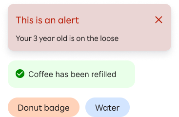
In-app notification alert
Badges
Tags
Alert toasts
Announcement
In-line alert
Type of notifications & framework
Communication: The type of information being delivered
Severity: The urgency of the information-whether it needs to be seen immediately
Action: Whether user action is required as a result of the information

Let’s take a look at a few use-cases
This process was a collaborative effort between design, product, and engineers. The hope is to identify edge cases and have our engineer help uncover related structural complexities.


At the same time, we want to start having conversations around the notification system's interactions, behaviors, and taxonomy. Here are some good high-level questions to ask and answer:
What would trigger the notification?
What type of feedback is being communicated?
Where would the notification appear and how?
Which notification would require an immediate interaction?
Is the notification persistent or non-persistent?
Composing Atomically
We knew from the product audit that a set of a base components were needed for milestone 1.0. We can use these components as the base skeleton to scale and expand upon the rest of the notification system.
Base components needed
In-line alert
Badges
Alert banners
Common denominator
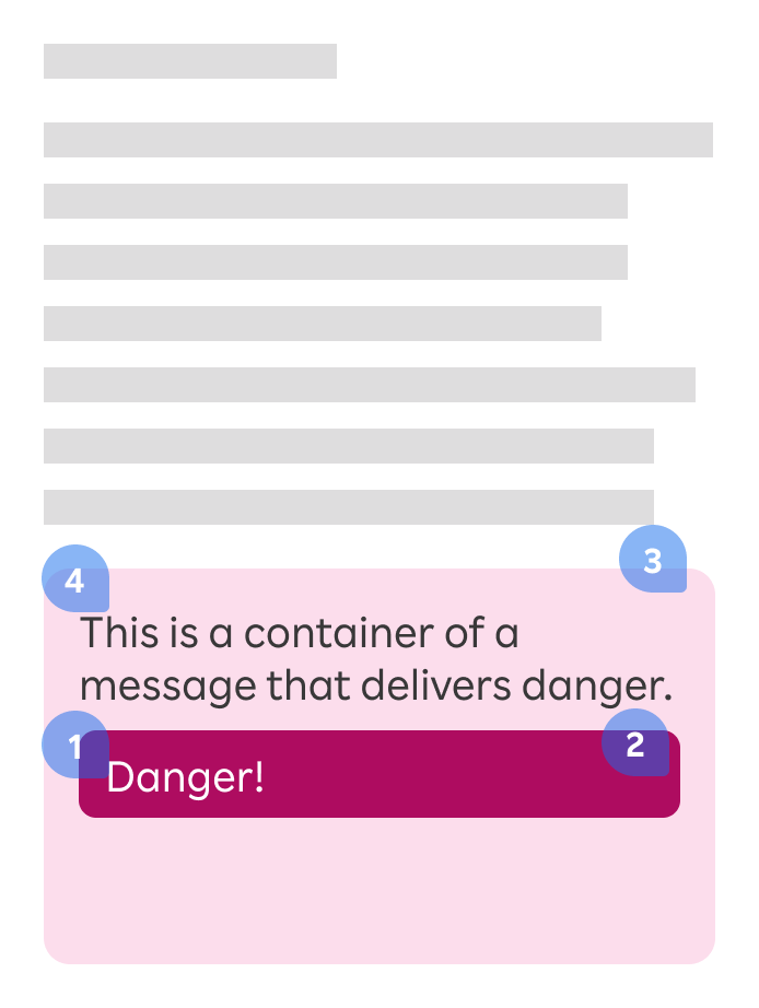
Text styling on a background
Alert system colors
Alert background colors
Message text styling in general
We then start to define the styling while being mindful of accessibility. We should not rely solely on colors to differentiate status and severity, so we introduced a system of alert icons.

Designing the system
In-line alert

Badges
Use a badge to label, categorize, or feature items with keywords. Badges are display-only and are not interactive
Page-level banners

A banner is a form of an alert and can serve as a blocking alert when paired with an overlay. They take over the top or bottom of an interface to show general notifications for the product or system, but not for a specific task.
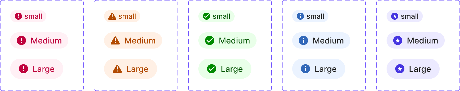
Message bars

Message bars are utilized to inform users of five types of information - Success, Warning, Error, Inform, and Promotional. Color and icons differentiate the state of alerts and the urgency of the data.
Use message bar for both content-level and page-level notifications.
A content-level message bar is within context inside of a content container.
A page-level notification bar is a top-level notifications sitting above all the content areas.
Contextual application
Handling multiple errors is always tricky. The most important thing is to convey message clearly, especially in the use-case of filling out medical forms.

A -
Using a container-level message bar to list out errors.
B -
When errors are triggered due to empty input returns, we would still utilize the message bar without necessary bullet-listing each outstanding item.

A page-level banner is an excellent option to convey success messages that are temporal and dismissable based on timing or on page reload.
Finally, documentations
There isn’t one set of rules that applies to all the notification systems. We defined the taxonomy, levels of interaction, persistent vs. temporal, and the visual feedback behaviors early to better incorporate them into the Matisse design system.

Other projects

GoodRx Product Redesign
Many initiatives were going at full speed in mid-2020. GoodRx product rebrand was one of a major significant success.
This new ‘look and feel’ has a code name ‘Matisse.’ Which later became the Matisse react library and the web design system I was leading on the platform team.

Building an Atomic Design System
Build a design system with product adoption in mind, team collaboration methods, and relative implementation processes.